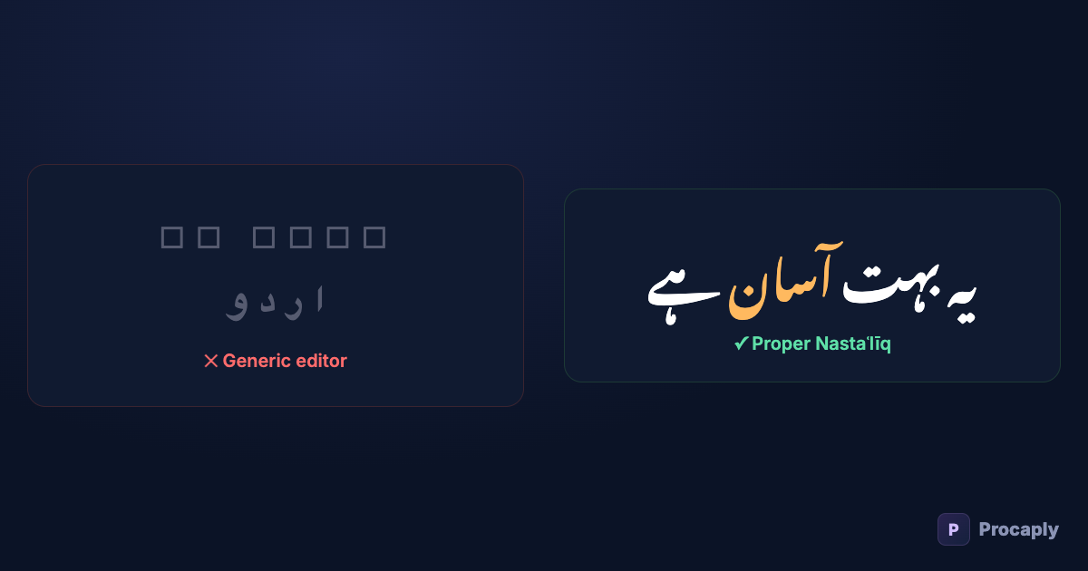
You paste Urdu text into your video editor and get one of these: empty boxes (□□□), letters printed separately like a ransom note (ا ر د و), the whole line running left-to-right, or a stiff Arabic newspaper font that no Urdu reader would call natural. Here's what's actually going wrong — and the checklist to fix it.
- Four separate rendering features have to work: glyphs, shaping, BiDi, and a Nastaʿlīq font.
- Broken joining (ransom-note letters) means the app's text engine can't be fixed from inside the app.
- "Technically readable but somehow off" almost always means Naskh instead of Nastaʿlīq.
- Never ship Urdu as a platform SRT — the platform's renderer replaces your font.
The four ways editors mangle Urdu
1. Tofu boxes: the font has no Urdu glyphs
Fonts only contain the characters they contain. The trendy display font you use for English captions almost certainly stops at Latin. Ask it for ک and it shrugs — the renderer draws a placeholder box ("tofu"). Fix: Urdu text needs an Urdu-capable font on that specific text layer.
2. Ransom-note letters: no text shaping
Urdu letters join, and change shape by position — ک looks different at the start, middle and end of a word. Turning "کتاب" into its joined form is a rendering step called shaping. Cheap text engines skip it and print each letter in isolated form. This is the classic sign of an editor that was never tested on Arabic-script text — and it's unfixable from inside that app.
3. Backwards text: no BiDi support
Urdu runs right-to-left, but the digits and English words inside it run left-to-right. Handling that mix is the bidirectional algorithm. Engines without it print your sentence in reverse or scramble the English words' position.
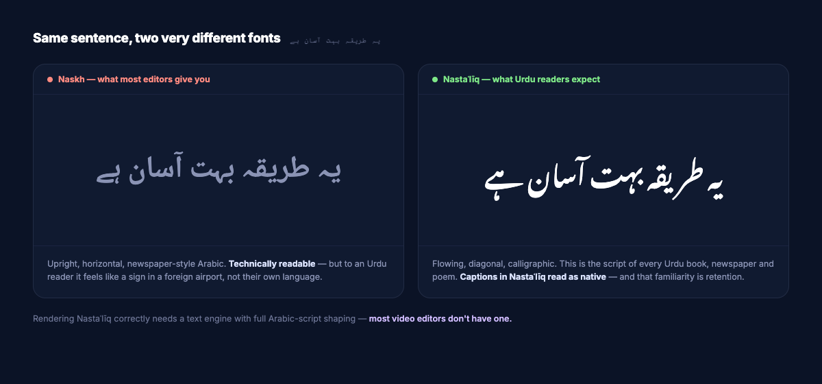
4. It renders… but in Naskh
The subtle one. Most "Arabic" fonts are Naskh — flat, horizontal, the style of Arabic newspapers. Urdu readers expect Nastaʿlīq — the flowing, diagonal calligraphic style of every Urdu book and news channel. Naskh Urdu is readable but feels foreign, the way English set entirely in Fraktur would. If your captions look "technically Urdu but somehow off", this is why.
Diagnosing your editor in 30 seconds
| What you see | What's broken | Fixable in-app? |
|---|---|---|
| □□□ boxes | Font has no Urdu glyphs | Yes — switch that layer to an Urdu font |
| ا ر د و separated letters | No Arabic-script shaping | No — the text engine itself |
| Sentence reads backwards / English words misplaced | No BiDi algorithm | No — the text engine itself |
| Joined and readable, but stiff and horizontal | Naskh font, not Nastaʿlīq | Yes — if the app accepts custom fonts and shapes them correctly |
The checklist for correct Urdu captions
- Font: a true Nastaʿlīq face — Noto Nastaliq Urdu (free, by Google) or Jameel Noori Nastaleeq.
- Line height: Nastaʿlīq hangs deep below the baseline — increase line spacing ~1.5× or descenders collide.
- Short lines: 4–6 words; the diagonal flow needs horizontal room.
- Test a mixed line: paste "یہ AI tool بہت اچھا ہے 100%" — if the English and digits sit correctly inside the RTL line, the engine does BiDi properly.
- Burn in, don't upload SRT: platform caption renderers pick their own font — usually Naskh — throwing away everything above.
The shortcut
Doing this by hand in a generic editor is possible; it's just work you repeat every video. Procaply ships all of it as the default: real Nastaʿlīq rendering with correct shaping and BiDi, sized and spaced for vertical video, previewed exactly as it burns — plus the transcription so you're not typing the Urdu in the first place. What you see in the editor is pixel-for-pixel what exports, because the same rendering rules draw both.
Frequently asked questions
Why does the same font work in Word but break in my video editor?
Word uses the operating system’s text stack, which includes full Arabic-script shaping. Many video tools use lightweight game-style text engines that trade correctness for speed. The font was never the problem — the engine drawing it is.
Can I mix Urdu and English captions in one video?
Yes — that’s normal desi content. The requirement is per-line font switching and BiDi handling, which purpose-built caption tools do automatically.
Is Jameel Noori Nastaleeq or Noto Nastaliq Urdu better?
Both are true Nastaʿlīq. Noto Nastaliq Urdu is the safer default: freely licensed, actively maintained, and consistent across platforms. Jameel Noori has a more traditional newspaper flavour that some creators prefer for literary content.
My editor shows Urdu correctly but the export is broken. Why?
Preview and export sometimes use different text renderers. If the export pipeline lacks shaping or the font, the burn silently falls back — one more reason to caption in a tool where the preview and the burn share one rendering path.